
Nautilus & ColorADD: Together for More Inclusive Design
A small symbol. A big step towards inclusion.
At Nautilus, we believe that inclusion is also shaped by how we communicate and make information accessible to everyone.
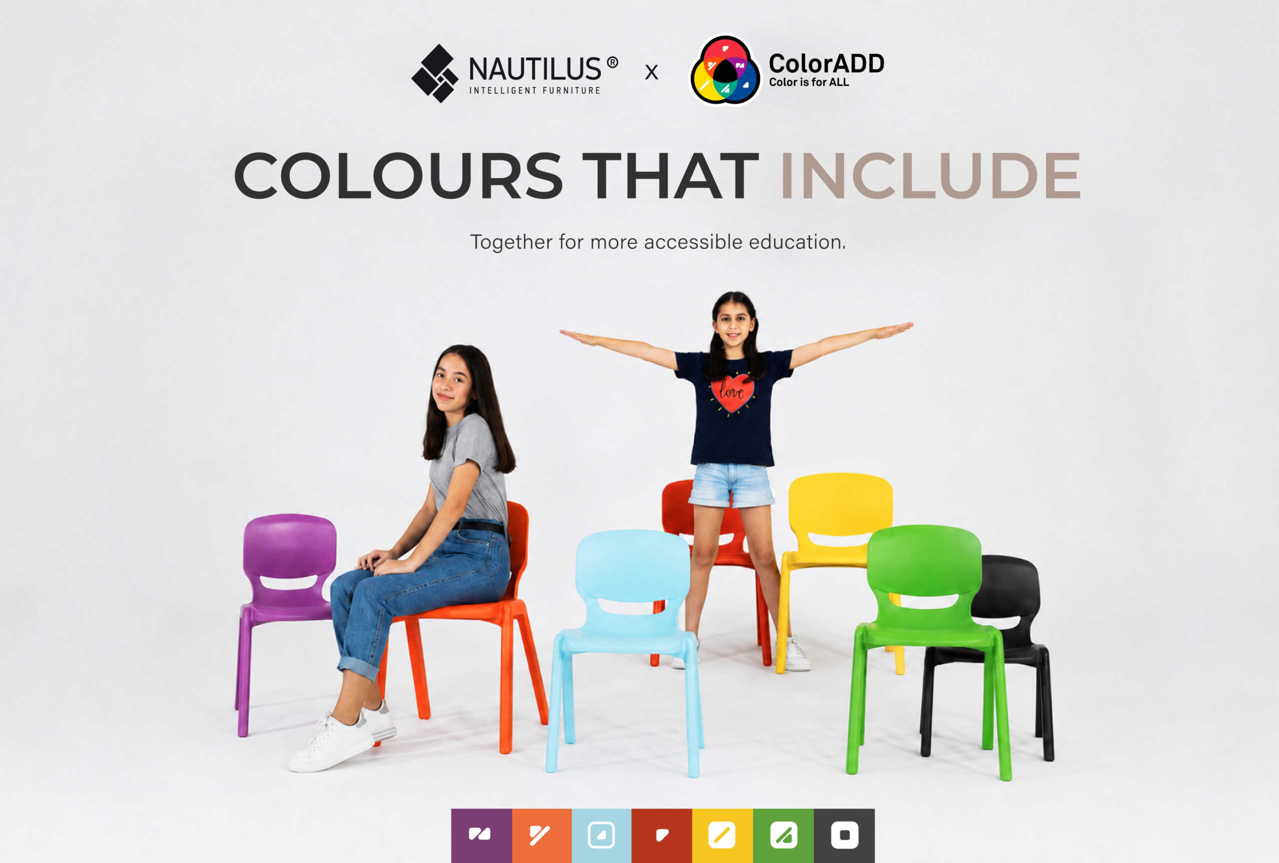
It is with this commitment in mind that the partnership between Nautilus and ColorADD was created, bringing together design, innovation and accessibility through a language that makes colours simple and universally identifiable.
Through this partnership, the ColorADD Code becomes part of the way Nautilus communicates and identifies colours, making them easier and more inclusive for everyone to interpret and choose.
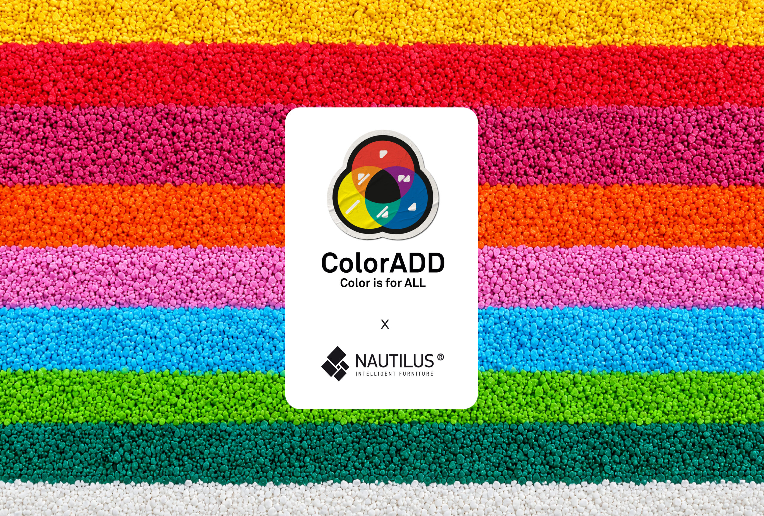
What if identifying a colour wasn’t quite so simple?
Colour is part of many of the choices we make every day and also plays an important role when selecting furniture, materials and finishes.
But we don’t all see colours in the same way.
Colour vision deficiency affects approximately 350 million people worldwide and can make it difficult to distinguish between certain colours. According to ColorADD, it is estimated to affect around 1 in 12 men and 1 in 200 women.
It is a difficulty that can easily go unnoticed, yet is present in many everyday situations.
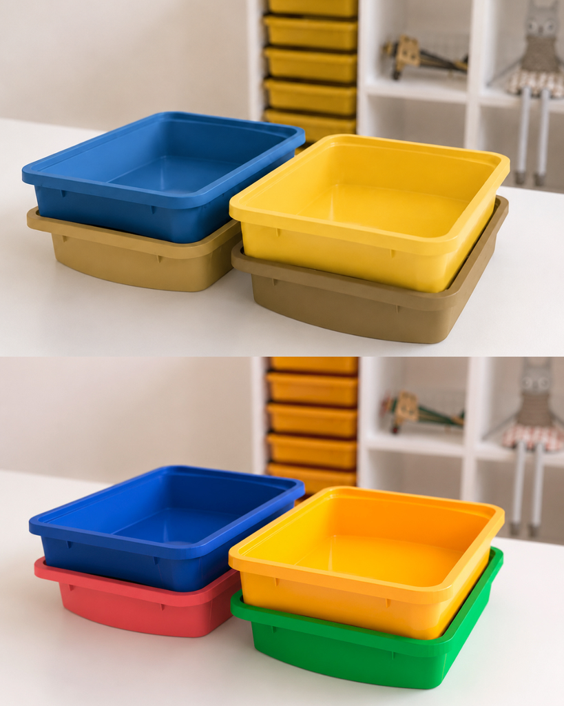
Which tray is green?
For many people, the answer is immediate. For others, colour alone may not be enough. This is where ColorADD comes in…
A universal, inclusive and non-discriminatory language for colour identification, developed to enable people with colour vision deficiency to recognise a colour whenever it is used for identification, orientation or choice.
The code uses graphic symbols associated with colours which, through different combinations, make it possible to identify a wide range of colours and shades.
This means that information no longer relies solely on colour perception: colours can also be read.
Inclusion starts with the smallest details
Choosing a colour may seem like a simple process. But a truly inclusive experience should ensure that everyone is able to make that choice.
This is precisely where this partnership makes a difference.
A symbol may seem like a small detail. But for those who have difficulty distinguishing colours, it can mean greater independence, confidence and equal access to information.
Communication with purpose
At Nautilus, we believe that inclusive design doesn’t end with the product. It is also reflected in how we present it, communicate it and make it accessible to those looking for it.
The Nautilus × ColorADD partnership represents another step forward on this journey, incorporating an inclusive language into the way we communicate colour and contributing to a more independent and accessible experience.
Accessibility for all. Inclusive colour communication. Design with a purpose.
Find out more here: